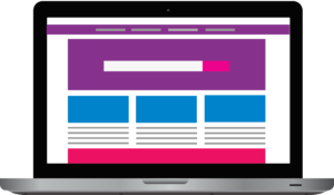
Elements of the best website design. Starting from the top you have a header. The header is the first thing that people see when they go to your website. The focus on a website starts from the top left and scans over to the right. It will then go down below that. Think of it as reading a book. You start from the top left to go to the right and then go down.

The Top
Below the header, you can put your menu. Underneath the menu I like to put a slider in there it will rotate between 3-5 images. I will often time put an overlay with text, a call to action or even a button that the website visitor can click on. As well as a call to action you can use a header If you have something that you want them to focus on. The headline that will draw their attention to what you want them to focus on. Use a header to accentuate the topic of your discussion.
Below the slider is where you would put your information on the homepage. This information is a visual layout of your website. I like to write a short blurb about each of the pages. Inside the blurb, you can add a link to each page for ease of navigation.
Main Section
You can then add a couple widgets that direct viewers to special categories you want them to be aware of. This is a good place for your marketing team to be aware of. If you have a special product or promotion you are running you can have a widget front and center. The widget placement on the website that will allow the visitor to go directly there.
You can add a sidebar. I usually like to add my Twitter feed and sign up form for a monthly newsletter. The newsletter gives you an opportunity to re-connect with your visitors. It also gives them an opportunity to come back to your website.
The Bottom
The last and final section is your footer. This is where you have the copyright information and maybe a few links to different places on the website. This is at the bottom of the website you don’t want to put super relevant information down here.
Above The Fold
Now the kicker to this all, you want to make sure all of this is above the fold. To clarify this, above the fold is a term coined by the newspaper industry. All the important information would be placed above the fold, or on the front page of the newspaper.
So when you are looking at it from a web design, above the fold would be information that is on the home page. The important information would be put up near the top, it makes it readable without scrolling. Studies have shown website users don’t like to scroll down the page, as result users don’t see the information that is put at the bottom of the website. Most users will leave the site if they don’t find the information above the fold, rather than scrolling down to find the information.
In conclusion, when you are looking at getting a website built their elements that should be followed for the best website design.
Are You Ready To Get Started?
If you have any questions, or you’re ready to get started on your website feel free to /contact-me/.
